

A 180-bed hospital in Ontario was about to order 40 infusion pumps. Then their asset tracking dashboard surfaced something uncomfortable: 28 pumps were already on site, idle in rooms nobody had checked. That single view prevented a six-figure purchase order.
This is what an asset tracking dashboard is supposed to do. Not impress a boardroom with live dots. Not generate reports nobody opens. One screen, one insight, one decision changed.
After 15+ years deploying IoT tracking across aviation, logistics, and heavy industry, I see the pattern repeat: the technology works fine, the dashboard doesn’t. Not because of software. Because nobody defined what question the dashboard needed to answer before the tags shipped.
Here’s how to build (or choose) a dashboard that earns its subscription.
What an Asset Tracking Dashboard Actually Does
An asset tracking dashboard is the operational interface that connects physical assets (equipment, containers, tools, vehicles) to their location, status, availability, and movement history. It pulls data from GPS trackers, RFID readers, Bluetooth tags, cellular sensors, manual scans, or any combination, then presents it in a way that lets someone act.
The word “act” is the dividing line. A dashboard that shows location without telling you whether the asset is available, overdue for service, or parked at the wrong facility is a map with a monthly fee.
Useful dashboards do a few things well:
- Surface exceptions that need a response, not data confirming normalcy
- Connect asset status to the workflow that depends on it (maintenance, dispatch, allocation, procurement)
- Show data freshness, so you know whether you’re seeing a live position or a stale echo from three days ago
- Distinguish between asset classes with different reporting cadences and rules
That freshness point gets ignored constantly. A feasibility study at Seoul National University Bundang Hospital found that battery constraints limited tag transmissions to 16 times daily, which the researchers questioned was adequate for emergency-department workflows. “Real-time” on the product label does not guarantee real-time on the floor.
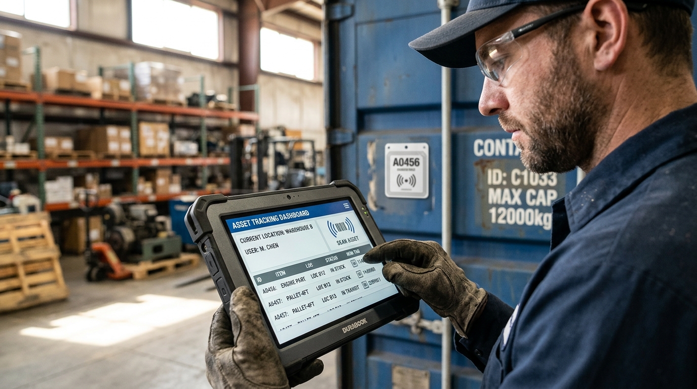
The Map Trap: Why Location Alone Isn’t Enough
The most common failure in asset tracking deployments is confusing location display with operational intelligence.
A dot on a map tells you where something is (or was, depending on freshness). It does not tell you whether the asset is available or in use, whether it should be there or somewhere else, whether someone needs to act right now, or whether the reading is current or hours old.
This is where the difference between shipment tracking and asset tracking shows up in dashboard design. Shipment tracking follows a package to its destination. The job ends at delivery. Asset tracking follows the entire lifecycle: deployment, use, return, dwell, maintenance, redeployment. Your dashboard must reflect that full cycle, not just the transit leg.
Saint Francis Medical Center’s deployment illustrates what this looks like in practice. Their system doesn’t just plot infusion devices on a floor plan. It integrates location with ON/OFF and Available/In-Use states, which lets the team achieve 100% preventive-maintenance compliance on 800+ devices and $60,000+ in avoided equipment losses annually.
Strip the status layer away, and you’re back to calling around asking “has anyone seen the bladder scanner?”
Five Dashboard Metrics That Drive Real Decisions
Forget widget counts and heatmap gradients. These five numbers consistently produce operational value, whether the tracked assets are containers, ground support equipment, or medical devices.
1. Availability rate
What percentage of your tracked assets are currently available for use? Not “located.” Available. The dashboard must distinguish between in-use, available, under maintenance, and unresponsive. Orillia’s pump discovery happened precisely because their system could separate “idle” from “in use,” revealing assets hiding in plain sight.
2. Utilization against fleet size
How often are your assets working versus sitting idle? 53% of asset tracking users report improved utilization, according to Verizon’s 2026 fleet technology trends report. The mechanism is straightforward: when you see that 40% of your container pool hasn’t moved in a given week, you stop buying more containers and start investigating why those sit dormant.
3. Exception count with ownership
Unauthorized movement. Missed check-ins. Geofence breaches. Overdue maintenance. Each exception needs a named owner and a response window. A dashboard showing 47 unresolved alerts from the past month is a dashboard nobody trusts. J&M Contracting recovered a stolen backhoe worth roughly $50,000 specifically because their movement alert triggered a named responder (fleet manager Garland Spivey) who relayed coordinates to law enforcement. The alert had an owner. That’s why it worked.
4. Data freshness
When was each asset last observed? If your dashboard shows a position from 72 hours ago with no staleness indicator, decisions are based on ghost data. Define acceptable freshness per asset type: a trailer parked at a depot might tolerate 12-hour updates. A ULD transiting an airport hub needs updates every few minutes. The dashboard should visually flag anything past its freshness threshold.
5. Cycle time
How long does it take for an asset to complete its operational loop? Deployment to return to availability. This is where asset tracking permanently separates from shipment tracking. In container pool management, cycle time is the difference between needing 500 containers and needing 800 for identical throughput. In MRO, it’s the difference between having enough tooling kits and renting emergency replacements.
If your current dashboard can’t answer all five questions without someone opening a spreadsheet, you have a visibility tool. Not an operational dashboard.
Match the Sensor to the Decision, Not the Spec Sheet
The technology conversation usually starts with “should we use GPS or RFID?” Wrong question. Start with: what decision does this data support, and where does that decision happen?
| Technology | What it tells you | Best for | Key constraint |
|---|---|---|---|
| GPS/GNSS | Outdoor coordinates | Trailers, heavy equipment, containers in transit | Accuracy degrades indoors and near obstructions |
| Cellular (LTE-M/NB-IoT) | Wide-area position + telemetry | Remote assets, cross-border moves, long battery life scenarios | Coverage gaps in rural/maritime zones; satellite hybrid extends reach |
| RFID | Automated presence at reader points | Handoffs, gate checks, receiving docks | Observation only where readers are installed |
| Bluetooth (BLE) | Proximity via device networks | Tools, smaller attachments, indoor zones with BLE gateways | Network density in actual operating areas determines reliability |
| UWB | Precise indoor coordinates | High-value equipment in warehouses, hospitals | Requires synchronized anchor infrastructure |
Mixed asset portfolios typically need mixed technologies. A logistics operator tracking containers across oceans needs cellular/satellite GPS trackers like the Oyster Edge, designed for long-duration outdoor deployments with years of battery life. The same operator tracking ground support equipment around an airport may add BLE or RFID at key checkpoints. Defense and government operations face similar multi-technology requirements with added security and compliance layers—learn more about military asset tracking implementations. The dashboard’s job is to unify these inputs into a single operational picture, regardless of which sensor produced the observation.
For aviation and airfreight, hardware certification is non-negotiable. A tracker that hasn’t passed DO-160 testing can’t legally ride inside the aircraft. The Thingfox T2, with DO-160 airfreight approval, solves a problem consumer-grade hardware physically cannot enter.
The GSMA’s integrated cellular and satellite tracking guide describes adaptive reporting rates that balance freshness, battery life, and cost. That trade-off is real and permanent: reporting every 2 minutes kills a battery in weeks; reporting every 6 hours saves battery but opens freshness gaps. Your dashboard design must reflect these constraints honestly, not paper over them with a clean UI.
Day-Zero Configuration: Where Deployments Stall
Something software vendors rarely discuss: the first week after deployment determines whether the dashboard gets adopted or abandoned.
I’ve watched this across dozens of rollouts. Tags arrive, get attached, the dashboard populates with dots. Then nothing changes operationally, because the team was never set up to use what they were seeing.
Before go-live, every alert type needs a person accountable for acting on it. “The system sends a geofence alert” is not a plan. “Diego in fleet ops receives the geofence alert on his phone and has 15 minutes to confirm or escalate” is a plan. J&M Contracting didn’t recover that $50,000 backhoe because they had GPS. They recovered it because the alert had a name attached.
Freshness thresholds need to be defined per asset class before anyone sees the dashboard. A portable generator at a construction site might tolerate 12-hour updates. A ULD transiting a hub airport needs minutes. Configure the dashboard to visually flag assets that have gone silent beyond their threshold, so operators immediately know which positions they can trust.
Most importantly, the asset register itself must be clean. Duplicate entries, retired assets still listed as active, items named “MISC-047” with no description. The dashboard faithfully displays garbage when it receives garbage. A systematic review of 42 RTLS studies identified integration problems and staff buy-in barriers as persistent adoption challenges, consistently ranking above hardware failures.
The hardware deployment (tags, gateways, connectivity) is usually the straightforward part. The organizational deployment (who looks at what, when, and what they do about it) is where value either compounds or evaporates. This is also why we emphasize end-to-end solution design over hardware catalogs: selecting a tracker without designing the response workflow is like buying a smoke detector and not deciding who calls the fire department.
Real Operations Where Dashboard Data Changed Outcomes
Theory is fine. Here’s what happened when teams used their dashboards to make different decisions.
Prevented purchase: Orillia Soldiers’ Memorial Hospital
After deploying RTLS across approximately 800 tagged assets, staff discovered 28 idle infusion pumps before ordering 40 new ones. GE Healthcare reported a 70% reduction in the need to purchase new pumps for that expansion episode. Bladder scanner retrieval time dropped from 40 minutes to 3 minutes. The value wasn’t knowing where equipment was. It was knowing which equipment was available.
Theft recovery: J&M Contracting
After previous unrecovered thefts, this Texas contractor deployed GPS tracking across trucks and nearly 40 pieces of heavy equipment. When a backhoe worth roughly $50,000 was moved over 17 miles from its jobsite outside operating hours, the alert went to a specific fleet manager who relayed coordinates to law enforcement. The dashboard mattered because the response chain existed before the theft happened.
Maintenance compliance: Saint Francis Medical Center
Integrating infusion-device location with ON/OFF and Available/In-Use states produced $21,000 in annual search-related cost avoidance and 100% preventive-maintenance compliance on 800+ devices. The implementation also taught a physical lesson: initial tag adhesion failed until the team changed mounting orientation. After the fix, zero tag failures. No amount of dashboard sophistication compensates for a tag that falls off the asset.
The common thread across all three: value came from connecting visibility to a specific operational response. Location data alone didn’t prevent the purchase, recover the backhoe, or schedule the maintenance. Data plus a defined workflow did.
When the Dashboard Isn’t Your Real Problem
Sometimes the problem isn’t the dashboard. It’s the process underneath.
If assets routinely leave your facility without being scanned, a prettier dashboard won’t fix the checkout process. If maintenance gets deferred regardless of what the screen shows, the issue is staffing or prioritization, not software. If nobody checks the dashboard because the data is three days old and they don’t trust it, the fix is freshness and reliability, not a redesigned color scheme.
I see companies invest in progressively more capable tracking platforms while ignoring fundamentals: Are the tags actually attached and powered? Are the gateways connected? Is anyone accountable for the exceptions the system surfaces?
There’s also a boundary worth watching as your deployment grows. France’s Conseil d’Etat reduced Amazon France Logistique’s monitoring fine to EUR 15 million in December 2025, validating certain real-time operational indicators while rejecting indiscriminate 31-day data retention. The lesson: operational monitoring and employee surveillance share infrastructure but not legitimacy. Keep the boundary explicit, especially as ambient IoT makes observation cheap and continuous.
The strongest deployments I’ve seen start the same way every time. Not with hardware selection. Not with dashboard demos. With one question: what is the most expensive operational failure you experience repeatedly, and what data would you need to prevent it?
Build the dashboard around that answer. Everything else is decoration.
If your container pool goes invisible after delivery, if ground support equipment vanishes between shifts, or if your MRO team spends more time finding tooling than using it, that’s the gap an asset tracking dashboard closes. Not with more data. With the right data, shown to the right person, connected to a clear response.
We design these systems end to end, from the tracker on the asset to the alert in your ops lead’s pocket. Talk to us and tell us what keeps going missing: info@datanetiot.com.
Frequently Asked Questions
What is an asset tracking dashboard?
An operational interface connecting physical assets to their location, status, availability, and movement history. It ingests data from GPS, RFID, Bluetooth, or cellular trackers and presents it so teams can act on exceptions, allocate resources, and verify asset condition. The value comes from actionable visibility, not raw location points.
How is asset tracking different from shipment tracking on a dashboard?
Shipment tracking follows a package to its destination and ends at delivery. Asset tracking follows the full lifecycle: deployment, use, return, dwell, maintenance, redeployment. An asset tracking dashboard must display cycle time, utilization, and availability across the entire loop, not just the transit segment.
What does an asset tracking dashboard cost?
Published software subscriptions range from $49/month for small asset counts to $499/month or more for enterprise tiers. Real total cost includes tracker hardware, gateways, connectivity, integration, training, and ongoing data administration. Budget for the installed system, not just the software line item.
Which tracking technology should feed my dashboard?
Match the sensor to the decision. GPS covers outdoor mobile assets but degrades indoors. RFID automates observations at installed reader points. Bluetooth reaches indoor areas with gateway infrastructure. UWB provides precise indoor coordinates but needs anchor installations. Most mixed-asset operations combine two or more technologies.
How do I calculate ROI on an asset tracking dashboard?
Measure attributable annual benefits (reduced search time, avoided purchases, recovered assets, lower rental costs) minus recurring system costs. Compare total implementation cost against annual net benefit for payback period. Use pilot data from your own operation. Borrowing another company’s ROI figure rarely transfers cleanly.
Are open-source dashboard options viable?
Platforms like Traccar offer free self-hosted GPS tracking with maps, alerts, and broad device support. Open source eliminates the subscription but not tracker hardware, connectivity, hosting, security patching, or administration overhead. Evaluate who will maintain and support the system long-term before treating self-hosting as a pure cost saving.




 +1 508 292 2210

2 Responses