

Long-term PM2.5 exposure contributed to 4.9 million deaths worldwide in 2023. Not a projection. Not a worst-case scenario. The actual body count from particles small enough to cross from lung tissue into the bloodstream.
And here’s what makes an air quality monitoring system more than a regulatory checkbox: 99% of the global population still breathes air above WHO’s recommended PM2.5 threshold. Even in the United States, where total emissions of six principal pollutants dropped 79% between 1970 and 2024, roughly 109 million people live in counties that exceed at least one primary air quality standard.
If you’re evaluating systems right now, whether for a building, a community network, a mine fence line, or a school district, you already know the problem is real. The harder question: which system fits your situation, your budget, and the decision you need it to support? The market ranges from $200 consumer devices to $100,000 reference analyzers. The label “real-time air quality monitoring” covers all of them equally, and it tells you almost nothing about fitness for purpose.
I’ve spent 15+ years deploying IoT sensor networks across industries, from aviation MRO to port logistics to environmental monitoring. The pattern is always the same: a sensor is only as good as its calibration, its maintenance plan, and the decision it feeds. This guide applies that lens to air quality, one slice of the broader environmental monitoring technology landscape.
What Air Quality Monitoring Systems Actually Measure
At its core, an air quality monitoring system detects pollutants in ambient or indoor air, converts those detections into concentration readings, and transmits the data somewhere useful. What gets measured depends entirely on what you need to know.
The most monitored class is particulate matter. PM2.5 (particles under 2.5 micrometers in diameter) drives the bulk of health burden from air pollution. PM10 (under 10 micrometers) captures coarser dust and pollen. Optical sensors estimate mass by measuring how particles scatter light. The accuracy of that estimate shifts with particle composition, humidity, size distribution, and the manufacturer’s calibration model.
Gases are the second pillar: ozone (O3), nitrogen dioxide (NO2), sulfur dioxide (SO2), carbon monoxide (CO), and sometimes volatile organic compounds (VOCs). WHO’s 2021 guidelines established evidence-based thresholds for PM2.5, PM10, ozone, NO2, SO2, and CO. Lower-cost devices typically use electrochemical cells or metal-oxide sensors. Both have cross-sensitivity issues. Some sensors respond to both NO2 and O3 simultaneously, making it impossible to isolate either pollutant without a separate measurement channel.
Context parameters matter just as much as the pollutant reading: temperature, relative humidity, wind speed and direction, barometric pressure, timestamps, and device status. A PM2.5 spike at 95% humidity may be condensation, not combustion. A system that doesn’t log context can’t distinguish between the two.
Here’s the part most product pages leave out. The system is a chain: inlet design, sampling method, calibration protocol, data transmission, correction algorithms, quality flags, metadata, and alert logic. Weakness at any link can make a technically impressive sensor operationally useless. A reading is not a measurement until it has been validated, corrected, and connected to a decision.
Three Tiers: Reference, Low-Cost, and Satellite
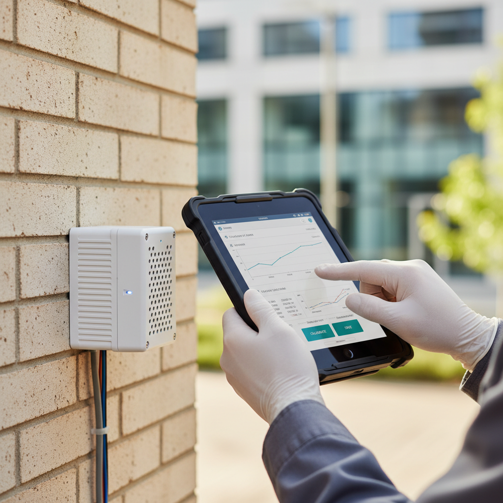
The air quality monitoring market breaks into three tiers. Picking the wrong one is the most expensive mistake you can make, because you’ll pay twice: once for the hardware, once to replace it when it can’t answer the question you actually needed answered.
| Tier | Mechanism | Best for | Typical cost | Core limitation |
|---|---|---|---|---|
| Reference / regulatory | Controlled inlet, established analytical method, formal QA/QC | Legal compliance, long-term trends, model validation | $15,000 to $100,000+ per station | Expensive, spatially sparse, fixed-site |
| Low-cost sensor network | Optical particle, electrochemical, or metal-oxide sensors in compact nodes | Neighborhood mapping, smoke events, schools, community science | $75 to $1,500+ per node | Drift, cross-sensitivity, humidity artifacts, variable data completeness |
| Satellite and mobile | Remote sensing from orbit, vehicle-mounted labs, drone sampling | Regional transport, source mapping, network gap analysis | Free (public data) to $50,000+ for mobile labs | Surface inference limits, cloud cover, route repeatability |
California’s 2025 low-cost sensor guidance breaks costs into useful bands: $75 to $500 for a single-pollutant device, $500 to $1,500 for one or two pollutants, and above $1,500 for three or more. Those are device costs. Add connectivity, power, mounting, collocation testing, data management, replacement parts, and the person who checks the thing every quarter, and the real number looks very different.
The right question isn’t “what’s the best air quality monitor?” It’s “what decision does this measurement need to support?” A regulatory filing demands reference-grade traceability. A school wanting to know when to close windows during fire season needs corrected PM2.5 coverage. A city evaluating traffic policy needs spatial density that no single reference station can provide.
The strongest architecture combines tiers: reference stations anchor accuracy, low-cost nodes fill spatial gaps, and satellite or mobile data add regional context. That’s not a sales pitch for complexity. It’s what the evidence supports.
The Accuracy Problem Nobody Calibrates For
Low-cost air quality sensors have democratized environmental data. They’ve also created a confidence problem. Both things are true, and pretending otherwise doesn’t help anyone making a purchasing decision.
EPA’s Air Sensor Toolbox describes these devices as lower-cost, portable, and easier to operate than regulatory-grade monitors. That accessibility has genuine value, especially in communities where EPA has committed roughly $81 million in Inflation Reduction Act funding to fill monitoring gaps. But accessibility and accuracy are not the same thing.
The numbers are stark. In EPA’s evaluation of emerging air sensors, ozone R2 values across different devices ranged from 0.39 to 0.97. One PM2.5 sensor returned an R2 of 0.007, meaning it explained less than 1% of actual concentration variation. Missing data rates ran 18% to 25% in some field deployments. A device labeled “real-time air quality monitor” can produce data that is, functionally, noise.
The fix is collocation. You place your low-cost sensor next to a reference-grade monitor, under the same air and weather conditions, for a sustained period. California’s guidance recommends three units alongside reference instruments for approximately two months. That yields a local correction model, a data completeness baseline, and an honest view of what the network can deliver.
A peer-reviewed study of PurpleAir sensors during wildfire smoke events shows exactly how this plays out. Uncorrected PurpleAir PM2.5 readings exceeded reference values by a factor of two in some cases. After applying a specific correction model, twelve of thirteen ambient sensors met EPA performance targets, and normalized mean bias error dropped to 10% or below at key AQI breakpoints. The study also found linear sensor response up to 200 micrograms per cubic meter but more complex behavior at higher concentrations.
The lesson: raw data from an uncalibrated sensor is not evidence. Corrected data from a validated, maintained network can be. Before deploying any low-cost system, demand clear answers: what correction model is applied, when it was last validated, what happens above 200 micrograms per cubic meter, and what the missing data rate has been in comparable deployments. If the vendor can’t tell you, your data won’t hold up when it matters.
Indoor Air Quality: CO2 Is Not the Whole Story
Indoor air quality monitoring operates on completely different logic than outdoor ambient monitoring. The pollutant mix is different, the exposure duration is longer (people spend 80% to 90% of their time indoors), and the corrective actions are building-level, not policy-level.
The most common indoor metric is CO2 concentration, typically used as a ventilation proxy. ASHRAE’s 2025 position document is direct about this: indoor CO2 concentrations are not overall indicators of indoor air quality. Indoor-outdoor CO2 differences can help evaluate ventilation rates and air distribution, but the evidence for direct health or performance effects at commonly observed indoor concentrations is inconsistent.
A building can show 600 ppm CO2, well within typical comfort ranges, while harboring a mold problem in the HVAC ducts, formaldehyde off-gassing from new furniture, or a PM2.5 issue from a nearby loading dock with the intake damper pointed the wrong way. CO2 tells you about dilution airflow. It doesn’t tell you what’s in the air that’s being diluted. Similar monitoring challenges appear in air cargo environments, where environmental conditions directly affect shipment integrity.
EPA’s reference guide for indoor air quality in schools identifies CO2, temperature, humidity, airflow, and additional diagnostic tools as relevant instruments. The value of these readings emerges when they trigger documented responses: adjust damper positions, replace filters, investigate a complaint, schedule duct cleaning. A green dashboard that never connects to building operations is decoration, not monitoring.
For indoor deployments, start here: define which decisions the data will drive, select sensors matched to those specific pollutants (not a generic “IAQ score”), set alert thresholds tied to building actions, and maintain the sensors on a schedule. If the system can’t tell you when to act, it’s collecting data you’ll never use.
Wildfire Smoke Rewrote the Monitoring Playbook
Before 2020, most people outside the environmental compliance world thought of air quality monitoring as someone else’s problem. Wildfire smoke made it personal.
When smoke settles over a city, PM2.5 concentrations can swing from “Good” to “Hazardous” within hours, and the variation between one neighborhood and another can be dramatic. Official reference stations, often spaced miles apart, can’t capture that block-by-block reality. Dense low-cost sensor networks showed their value precisely in these events, filling spatial and temporal gaps where reference coverage was thin.
EPA’s AirNow Fire and Smoke Map is one of the strongest examples of tiered monitoring in practice. It combines data from regulatory monitors, corrected low-cost sensors (including PurpleAir), and satellite-derived smoke plume imagery. Reference stations anchor accuracy. Low-cost nodes add density. Satellite data provides plume context, though it can’t see through clouds or operate at night.
Wildfire smoke also exposed a calibration blind spot. Most low-cost PM2.5 sensors ship calibrated for normal ambient conditions: moderate concentrations, typical particle composition. Wildfire smoke is different in every dimension: particle size, organic composition, humidity interaction, and concentration range. A sensor that performs well at 30 micrograms per cubic meter can behave unpredictably at 300. The PurpleAir correction study specifically documented this: linear response held up to about 200 micrograms per cubic meter, then required a separate fit for higher concentrations.
If smoke events are part of your operating environment, whether you run outdoor workers, manage buildings with natural ventilation, or operate logistics in fire-prone areas, your air quality monitoring system needs validation under extreme conditions. Average-day performance specs won’t protect anyone when the air turns brown.
Where the Market Goes from Here
Market estimates for air quality monitoring systems range from $5.8 billion (Grand View Research, 2024 base) to $9.6 billion (MarketsandMarkets, 2026 base), depending on scope and inclusion criteria. The variance itself is informative: this isn’t one market. It’s regulatory analyzers, low-cost consumer devices, industrial continuous emissions monitoring, indoor sensors, software platforms, and professional services wearing the same label. Growth projections cluster around 7% to 7.5% CAGR through 2031.
Three forces are reshaping the field right now:
Satellites are becoming operational monitoring tools. NASA’s TEMPO instrument provides hourly daytime observations of NO2 and formaldehyde across North America, with derived near-surface ozone estimates. Its mission was extended through at least September 2026 after a successful prime phase. TEMPO observed exceptionally high ozone over Houston on August 2, 2024. Satellite data doesn’t replace surface monitors. It gives them context: regional transport, plume movement, and source-area identification at scales no ground network can economically cover.
Regulation is converging and tightening. EU Directive 2024/2881 mandates common assessment methods, monitoring of current conditions and long-term trends, comparable public information, and alert thresholds for vulnerable populations. It includes a scientific review clause every five years. For any organization operating across borders, this means auditable data lineage, traceable calibration records, and open pathways from sensor output to public reporting. Proprietary black-box systems become a compliance liability under these frameworks.
AI improves calibration and prediction, but introduces opacity risk. Machine learning can detect sensor drift, infer missing values, classify smoke events, and correct humidity artifacts. A 2025 review documents the integration of low-cost sensors, satellite mapping, and geospatial AI for intra-urban pollution prediction. The risk is that a model correcting readings in ways users can’t inspect creates “data quality” that’s only as trustworthy as the training data behind it. Always ask: what’s the correction range? What happens outside that range? Can I see the raw data?
The winning architecture for the next market cycle combines all three evidence layers: reference anchors for traceability, dense IoT sensor networks for spatial coverage, and satellite or mobile data for regional context. The connector is software that can reconcile these sources, flag uncertainty, and trigger the right operational response.
Choosing a System: Start with the Decision, Not the Sensor
The selection failures I’ve seen across 15 years of IoT deployments always start the same way. Someone picks the hardware first and defines the problem second. Air quality monitoring is no exception.
Start with these questions:
- What decision does this data support? Regulatory compliance, building ventilation control, community health alerts, wildfire response, fence-line monitoring, and ESG reporting each demand different accuracy levels, averaging periods, and pollutant coverage. A system that’s perfect for one is wrong for another.
- What’s your evidence standard? Legal filings require reference-grade instruments with formal QA/QC. Internal operational decisions can use collocated, corrected low-cost networks. Community awareness has a different threshold again.
- Who maintains it? A sensor with a 6-month calibration cycle needs someone trained to do it. A network of 50 nodes needs a replacement schedule, firmware management, and a data quality review process. Budget for operations, not just acquisition.
- What’s the data infrastructure? Can your team ingest, store, flag, correct, and visualize continuous sensor data? If not, a managed platform or integration partner is part of the solution, not an add-on.
- What’s the physical environment? Coastal humidity, extreme cold, desert dust, wildfire smoke, or industrial emissions near the site will each affect sensor performance differently. A device validated in a temperate suburban setting may drift badly on a Gulf Coast port or an alpine construction site.
California’s guidance consolidates this into a practical checklist: purpose, pollutants, budget, portability, connectivity, data access, maintenance, lifetime, and real-world performance. Solid framework. I’d add one more item: what happens when the system shows you something bad? If there’s no response protocol, you’re collecting data no one will act on.
When the system works, the outcomes are measurable:
- Wildfire-impacted school districts using corrected PM2.5 networks can make close-the-windows decisions based on local readings rather than a regional forecast miles away.
- Dense urban deployments like Perth’s 200-sensor network resolve air quality at 200-meter resolution across 9,700 square kilometers, giving city planners pollution data at the traffic-corridor level.
- Industrial fence-line monitoring replaces periodic manual sampling with continuous data, catching emission spikes that a quarterly visit would have missed entirely.
For organizations already running IoT infrastructure for asset tracking, fleet visibility, or environmental sensing, air quality monitoring plugs into the same architecture: ruggedized hardware, cellular or satellite connectivity, cloud data management, and automated alert workflows. The sensor type changes. The deployment logic is the same. The same reasoning applies if you extend into water quality monitoring sensors alongside air, or into greenhouse environmental monitoring for controlled growing conditions. If you’re exploring environmental monitoring for temperature, humidity, or air quality across distributed sites, our environmental tracking solutions are built for exactly that kind of deployment: field-grade hardware, scalable connectivity, and data you can actually trust.
If your current setup gives you numbers but not decisions, that’s the gap worth closing. Talk to our team and we’ll figure out what fits.

Frequently Asked Questions
What pollutants does an air quality monitoring system detect?
Most systems measure particulate matter (PM2.5, PM10) and common gases (ozone, NO2, SO2, CO). Advanced units add VOCs, black carbon, or ultrafine particles. South Coast AQMD’s AQ-SPEC program evaluates sensors across all these categories. The right question isn’t how many pollutants a sensor covers, but which pollutants matter for your specific use case and regulatory context.
Are low-cost air quality sensors accurate enough to rely on?
It depends on the device, the conditions, and whether you’ve performed collocation. EPA evaluations show R2 values ranging from 0.007 to 0.97 across devices. After proper collocation and correction, many low-cost sensors perform well for screening and trend detection. Without local validation, a reading from a $300 device may carry no useful information.
Can PurpleAir sensors be trusted during wildfire smoke?
Only with a correction model applied. Raw PurpleAir PM2.5 readings can overstate concentrations by a factor of two during smoke events. A peer-reviewed correction brought twelve of thirteen sensors within EPA performance targets. Always check which correction version your data source uses and whether it has been validated for high-concentration smoke conditions.
Does a CO2 monitor tell me if my indoor air is safe?
No. ASHRAE’s 2025 position states that CO2 is not an overall indicator of indoor air quality. CO2 reflects ventilation dilution, not the presence of mold, particles, chemical off-gassing, or other specific hazards. Use CO2 as one input alongside pollutant-specific sensors and building inspections.
How much does a complete air quality monitoring system cost?
Single-pollutant low-cost sensors start at $75 to $500. Multi-pollutant nodes run $500 to $1,500+. Reference-grade stations range from $15,000 to over $100,000. Total cost of ownership includes connectivity, mounting, calibration, data management, and maintenance, which often equals or exceeds the hardware cost over a three-year cycle.
What is the AQI and how does it work?
The Air Quality Index is a standardized 0-to-500 scale that translates pollutant concentrations into health categories, from Good to Hazardous. EPA established a nationally uniform index in 1976. Each measured pollutant generates a sub-index based on its concentration relative to health standards; the highest sub-index becomes the reported AQI for that location and time period.







 +1 508 292 2210

4 Responses